This month I’ve really settled into my new home and have finally started enjoying some of the hobbies that I’ve not had the space or energy to practice in literal years. So far I’ve resumed painting, drawing, embroidery and gardening.
Last week I pulled out my paints, after organising my art supplies and desk in the weeks before, and got started on my first painting in years.
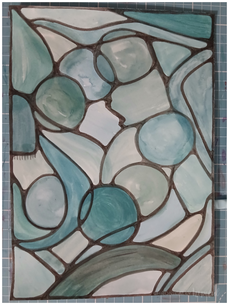
It started out by me just filling pages with rehydrated gouche that had been dried up on my pallettes since the last time I used them. I hate washing my pallettes when there is perfectly good paint pigment still sitting in them. I prefer to rehydrate it and use it up, even if just creating colour washes that I can then use at a later date as a base for an art piece. That’s what I did here.
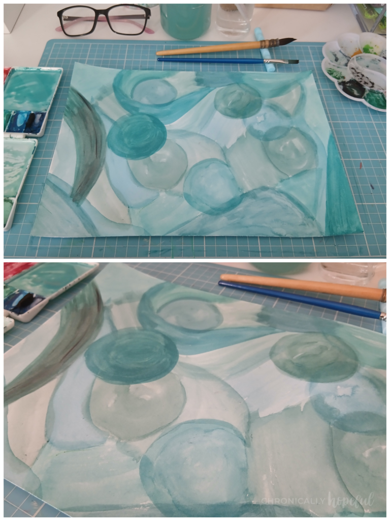
So I decided to use only the shades of green and blue that were in the pallettes already. No new paint mixes. I used large brushes to make various shapes all over the page and varied the amount of water I added to adjust the opacity.
I think the last time I painted was for some Christmas decor I made a few years ago, so there was a lot of green to use up!
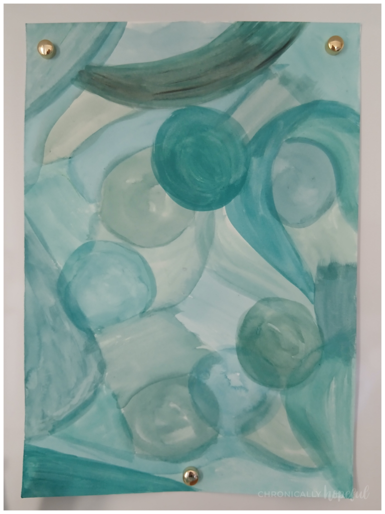
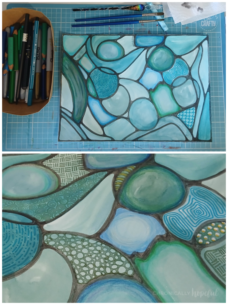
A few days later, I saw it on my desk looking very pale and washed out, it was time to add some contrast.
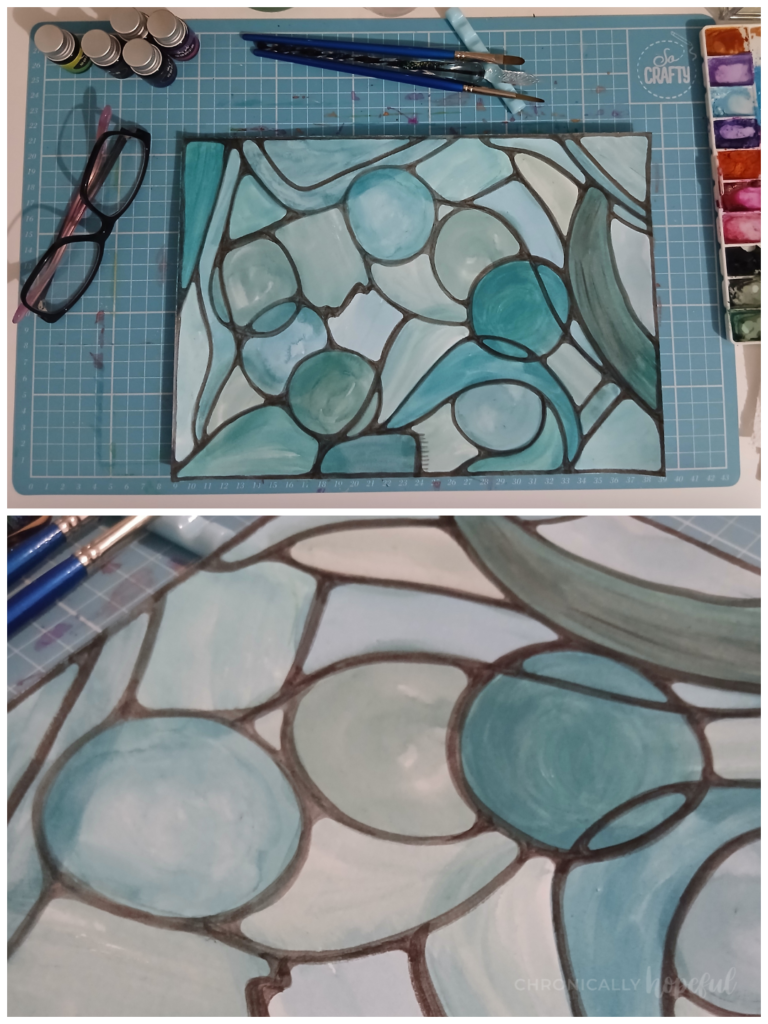
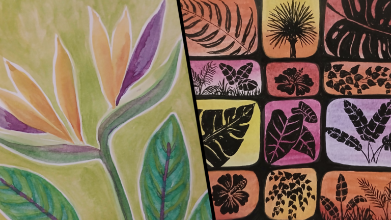
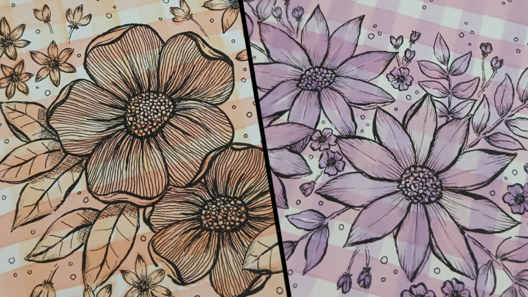
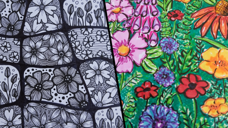
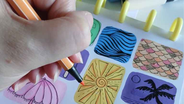
Using black sumi ink and a firm brush, I outlined all the shapes. This provided definition and contrast. While I left it to dry, I collected all my art supplies that matched the colours on the page. This included sharpies, stabilo markers, fineliners, coloured pencils, gel and ink pens as well as acrylic paint markers.
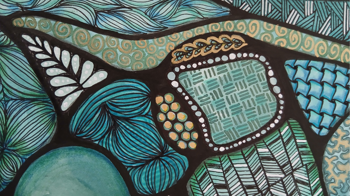
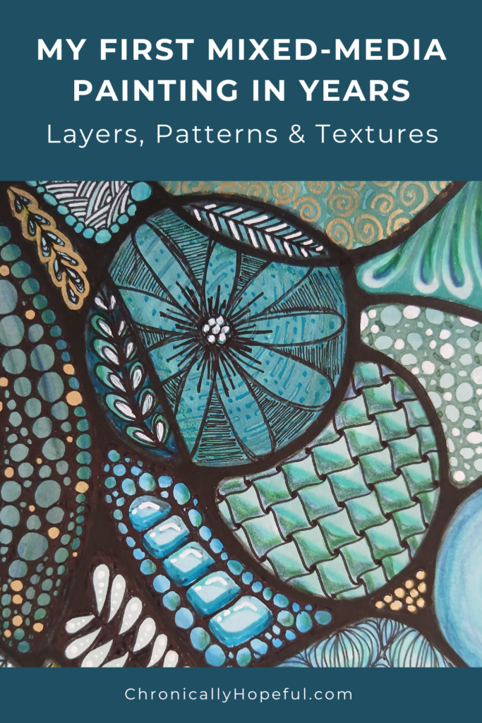
Over the next few days I slowly added shading and background patterns or textures to the various shapes. I used a few different doodling or drawing techniques to fill the shapes, including some zentangle and mandala inspired patterns. Purposefully leaving a few of the shapes empty to create some breathing space. A resting place for the eyes amongst the busy patterns.
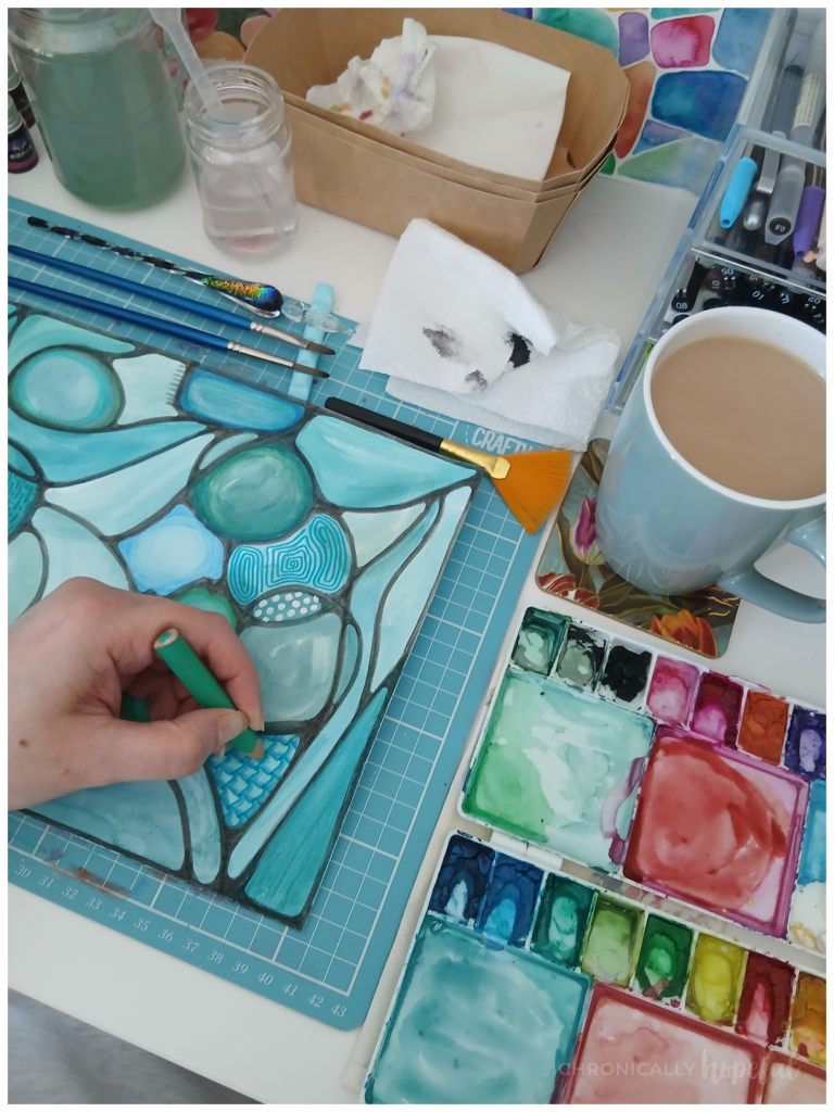
I really liked how it was looking at this point, but felt like it needed a bit of warmth and sparkle, so I used a shimmery red-gold paint to highlight some of the existing marks I’d made. I feel like this really added a bit more interest, and the shimmer draws the eyes across the page.
After that, I went back in with a white acrylic paint marker and created lots of bright markings or highlights all across the painting, to achieve the same effect as the gold paint, as well as going over the black lines with a second layer of sumi ink to really make it pop.
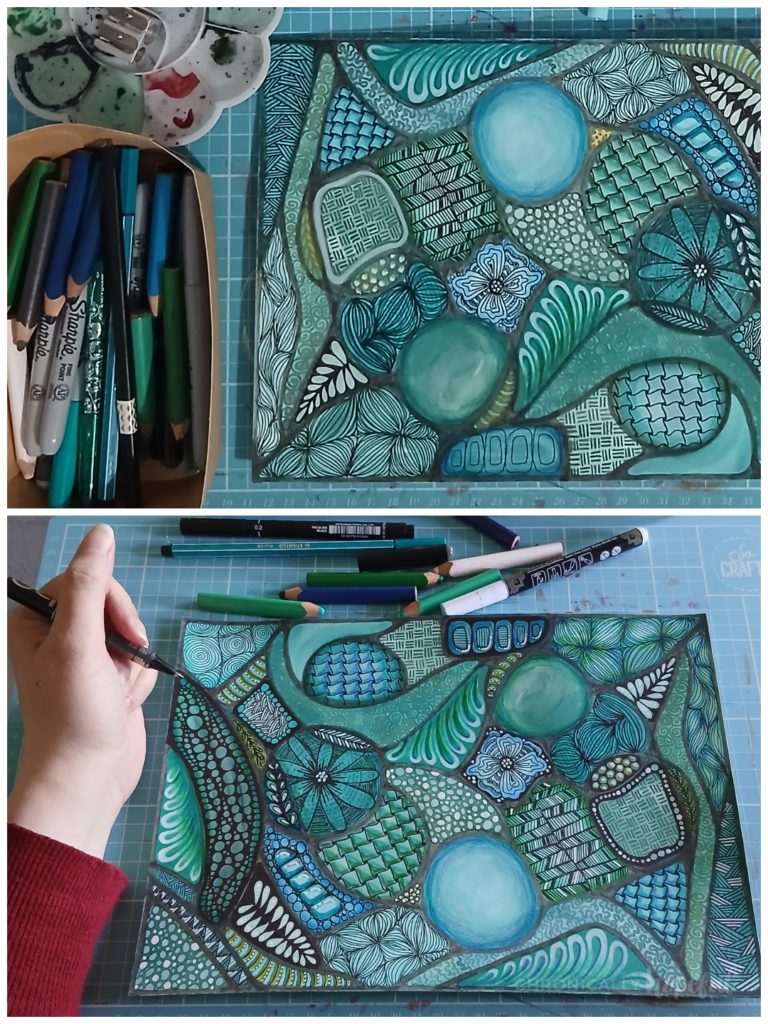
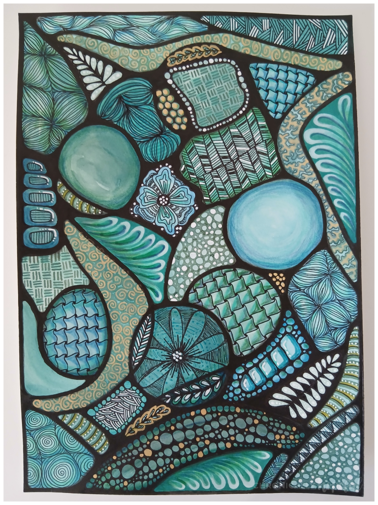
Those final steps created a lot more contrast with super dark darks and super light lights. The very light and dark elements stand out from across the room. Exactly what I was aiming for.
The reason I think that contrast is so important, is that it allows you to see certain things from a distance, the difference in saturation of colour draws your eye, the sparkle helps too.
Then when you come closer, you start to notice more details, things you cannot see from far away, but they add so much interest, each mark and shade variation plays a part.
In my eyes, that’s what makes art more interesting. And that is what I am trying to improve on with my own pieces.
I hadn’t really done anything creative in a very long time, due to a lack of space as well as health issues and other things taking my time and focus, I just was not able to comfortably manage it.
I’m very grateful to be able to exercise my creative side again though, and I really had a lot of fun getting my hands dirty, quite literally!
So what started out as a pale watercolour / gouache wash to clean my pallette, has turned into a very detailed mixed-media artwork which I really love.
I’d love to hear your thoughts on this piece, or my process, in the comments below. Also, let me know if you’ve shared any art recently, so I can check it out too!
Details About This Art
Created by: Chronically Hopeful Char
Paper: A4 Hot pressed (smooth) watercolour card, 300gsm
Medium: Mixed, including gouache, gold watercolour, acrylic paint pens, fineliners, gel and ink pens, coloured pencils, alcohol and water-based markers, sumi ink
Additional tools: paint brushes, aquabrushes, dip pens
(Click on images to zoom in)


Blog Parties & Link-ups where I’m sharing this post. Click here to see my link-up calendar and find new blogs to enjoy!
Discover more from Chronically Hopeful
Subscribe to get the latest posts sent to your email.