Welcome to the second week of the Chronically Hopeful 52-Week Art Project! This week, being week 28 of the year, we are being inspired by Summer Blooms. I’ll be sharing my creations for this prompt below as well as adding it to the gallery. Feel free to jump in anytime if you’d like to join me on this easygoing, no-stress, creative adventure.
Project Overview
- A creative project or those of us who can’t create daily, for whatever reason.
- There is 1 prompt per week to interpret in any way & take your time with.
- Use any medium (collage, clay, paint, photography, baking, knitting, lego, fabric, etc)
- Share your creations to the gallery & be inspired by others creations.
- No social media accounts needed.
Visit this page for more details.
Wk28 Prompt: Summer Blooms
I was hoping to have my own garden flowers as reference for this week’s prompt, but my new garden has grown slower than I expected and there’s not much in bloom yet. So I was inspired by what I’d been hoping for and what I’ve seen in other lovely gardens instead.
As usual, I have worked on multiple pieces throughout the week. Some are partially done, others I managed to complete.
I’ve been pretty fatigued this week, with the heatwave and some other things going on, so I started with easy to access art – just pens, markers and pencils in my discbound journal. Something I can do while resting on the sofa, no water or messy paints involved. I didn’t even need to be upright and could work on it while reclined.
Much of the first piece was done in low light too, as I keep the blinds down during the heat of the day, which during the heatwave is almost all day, unfortunately. The AC is still not working despite multiple visits by the technician. Fans and ice packs are doing overtime!
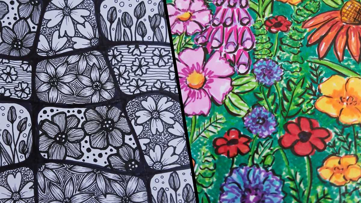
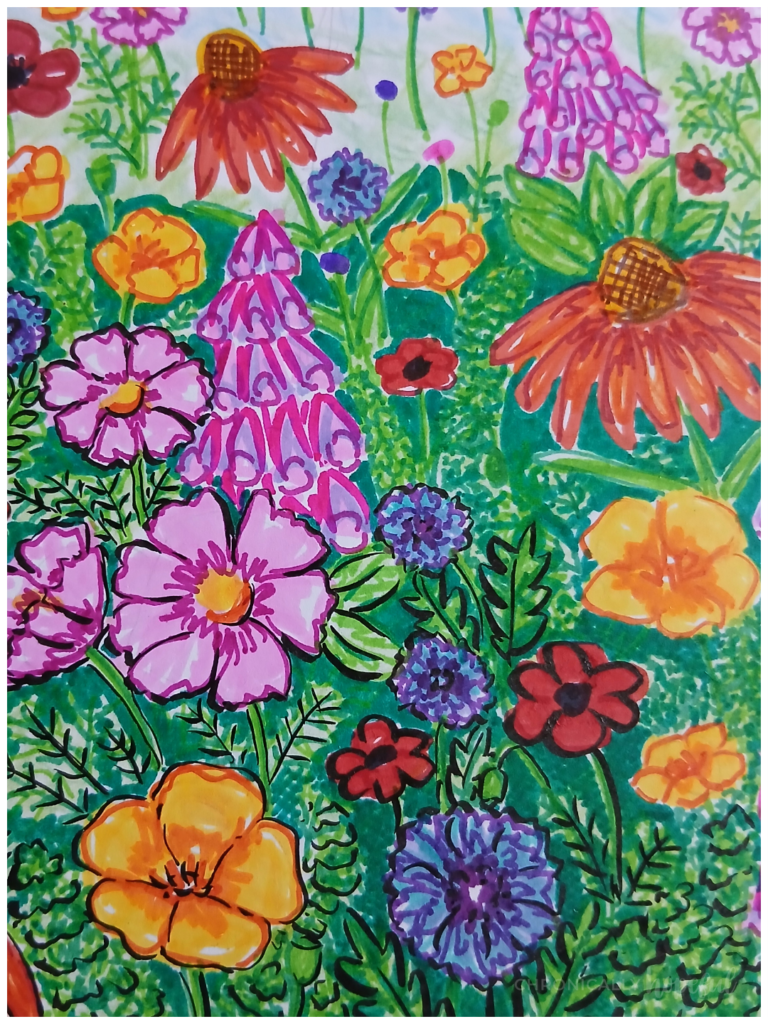
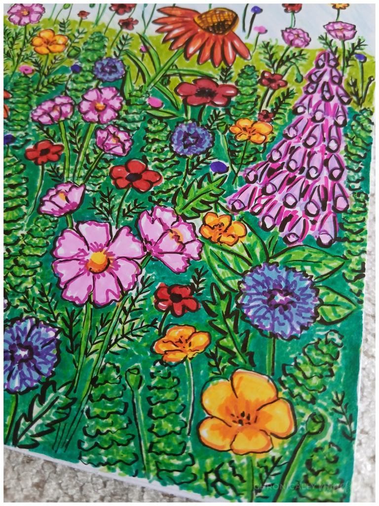
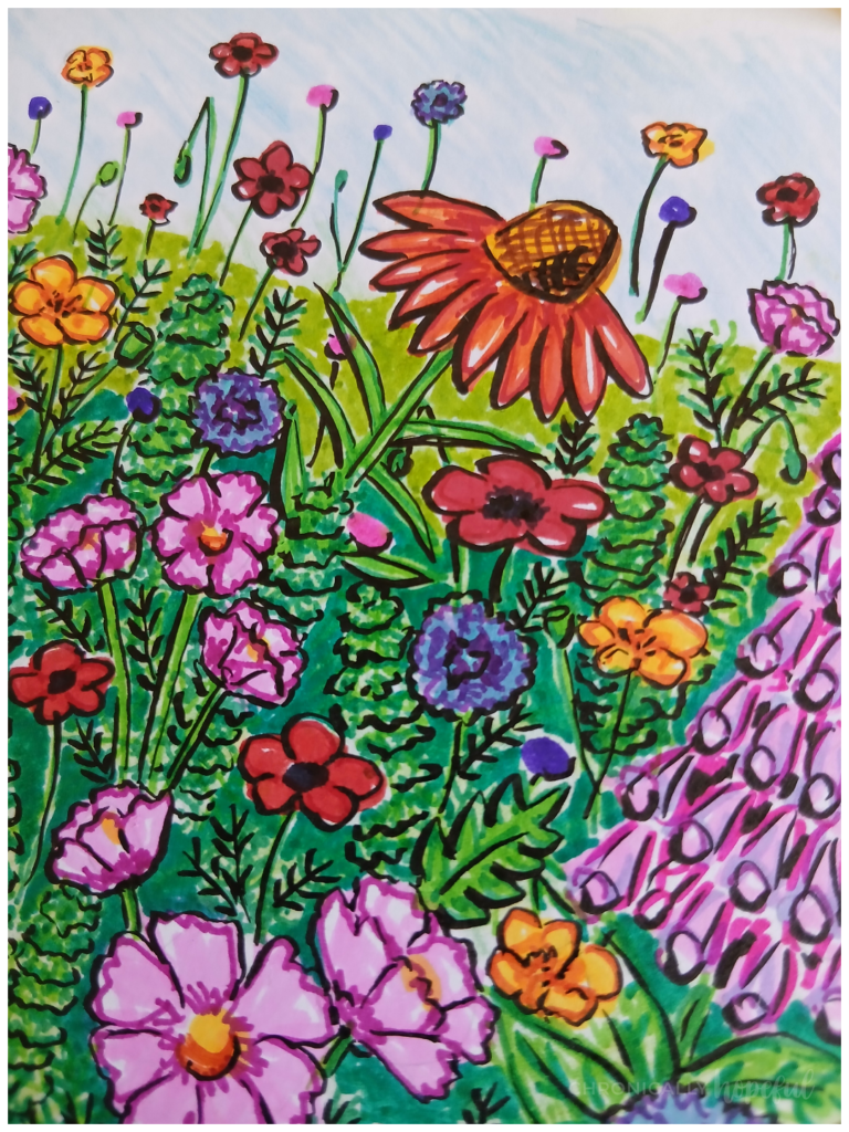
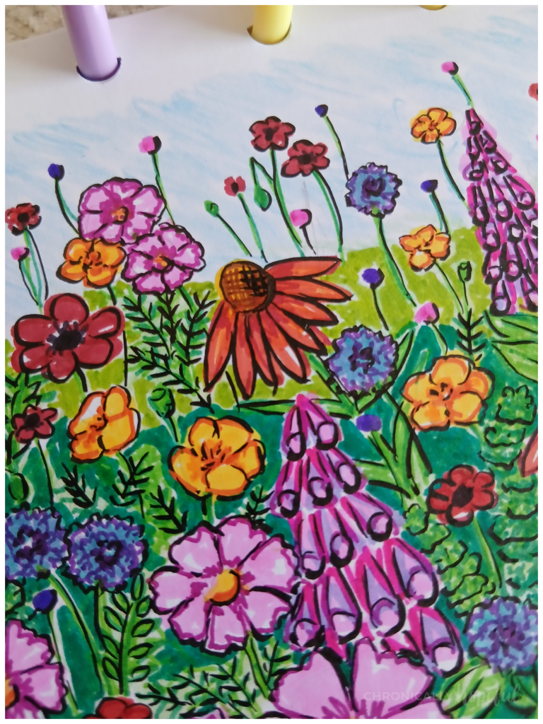
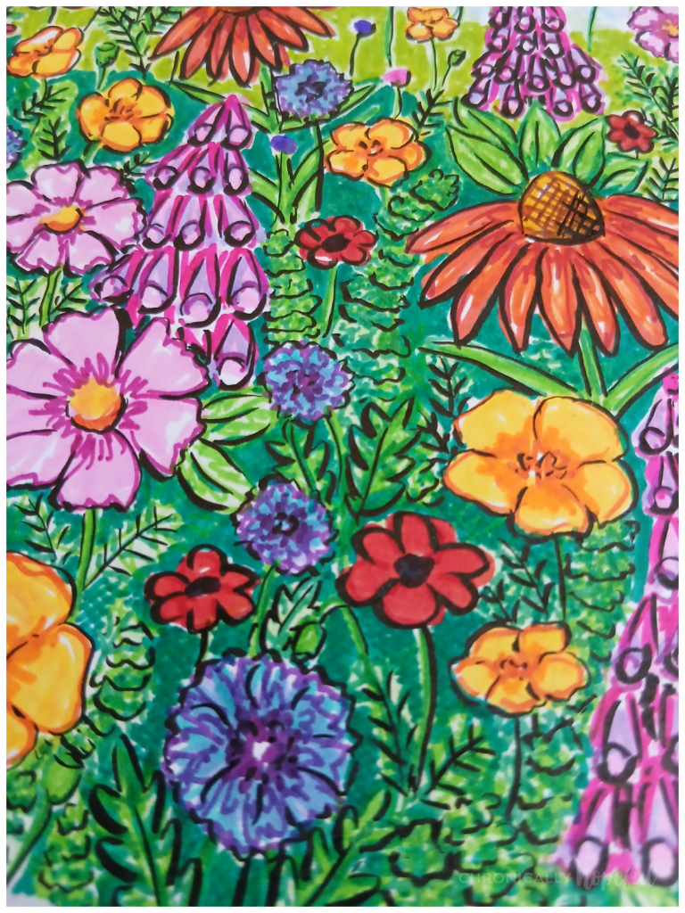
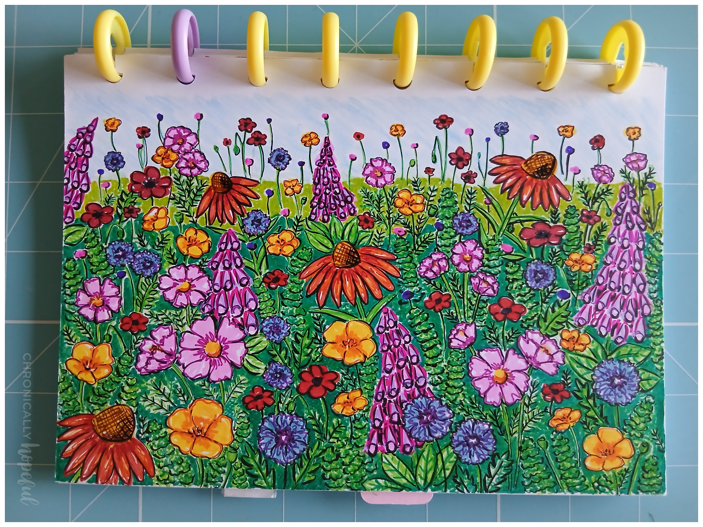
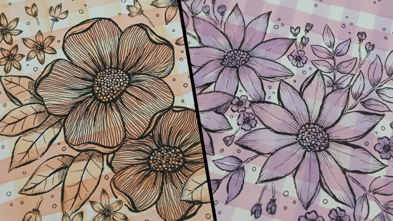
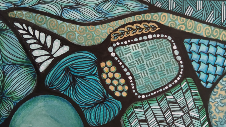
Wildflower Meadow – Pens, Markers, Coloured Pencils, Brush Pen
I thought I’d try doing a colourful piece with markers and coloured pencils. Not something I usually do, it’s quite a different style for me. And honestly, I was not really happy with how it turned out initially. But I kept working on it throughout the week, and now I love it!
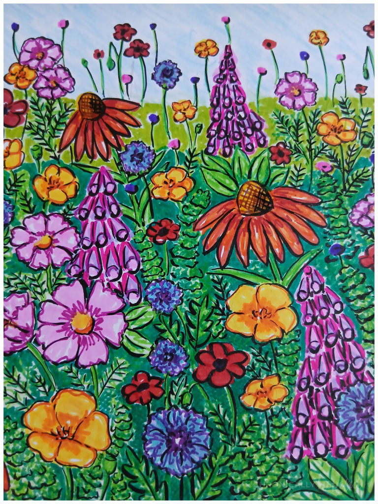
Being disappointed with it initially, I’d put it down to work on something else and then pick it up again to add more layers. I went back and forth mutliple times. Now this wildflower meadow has turned out to be one of my favourites from the project so far. Let me walk you through the process.
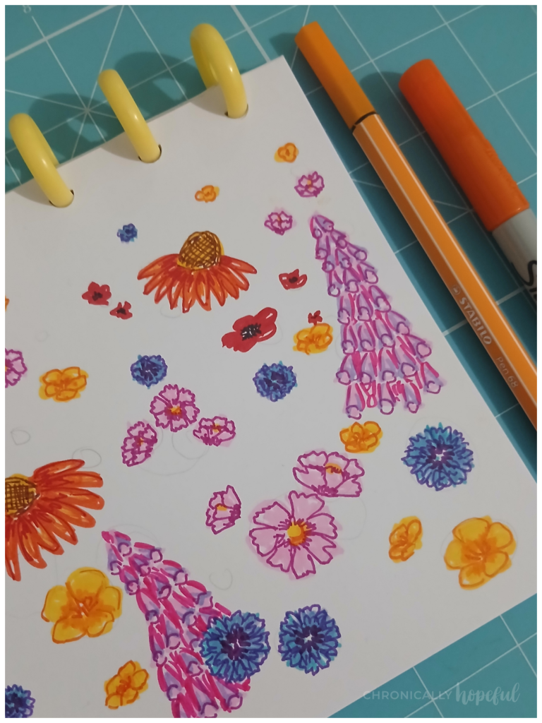
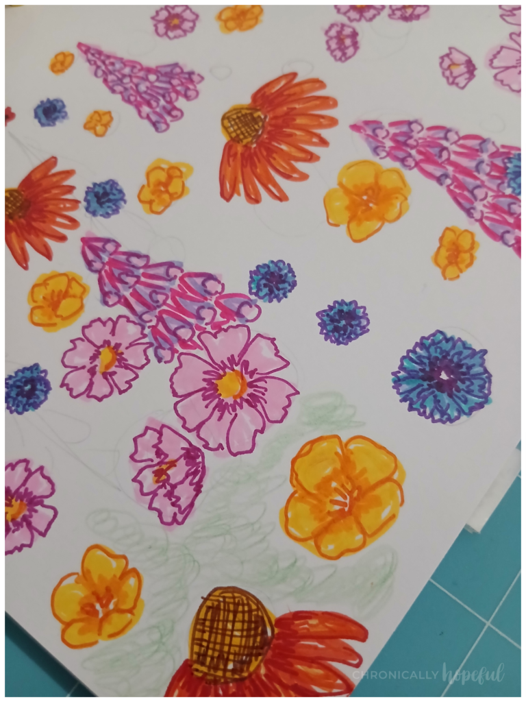
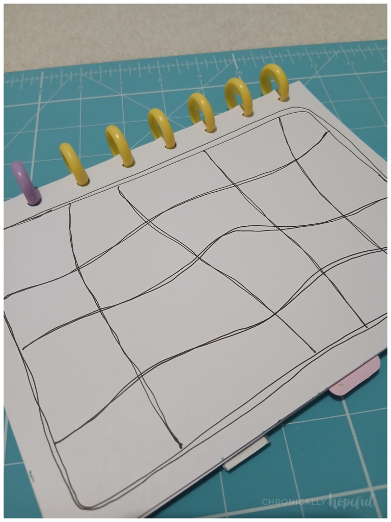
I started with very loosely placed pencil circles on my journal page. This was to give a vague idea of where larger or smaller blooms might be, mapping out the general composition.
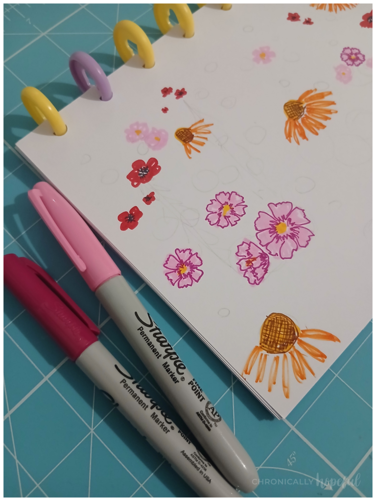
I then went in with felt-tip markers of various types to sketch some floral shapes. I thought of red Poppies, bright yellow Californian Poppies, blue Centaurea, purple Foxgloves, orange Echinacea and pink Cosmos. A whole wildflower meadow!
As I recently discovered, I prefer contrast and bold lines, so I added outlines in darker shades to try and provide that definition. I tend to use a lot of black lines in my art, so I tried to do it differently this time. Using darker shades of the colour of each bloom. I still wasn’t happy with it, but I moved on to the background.
Using coloured pencils I lightly coloured with green and blue to cover the white space before using markers to add foliage details. Again, colouring very loosely, in a criss-cross pattern.
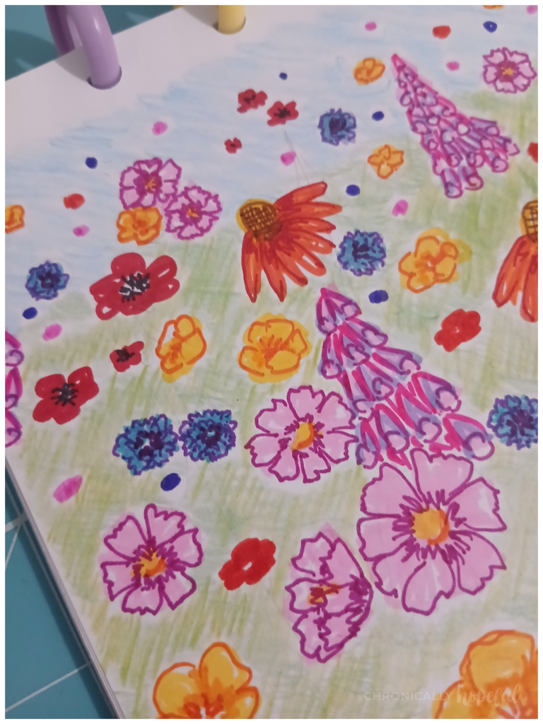
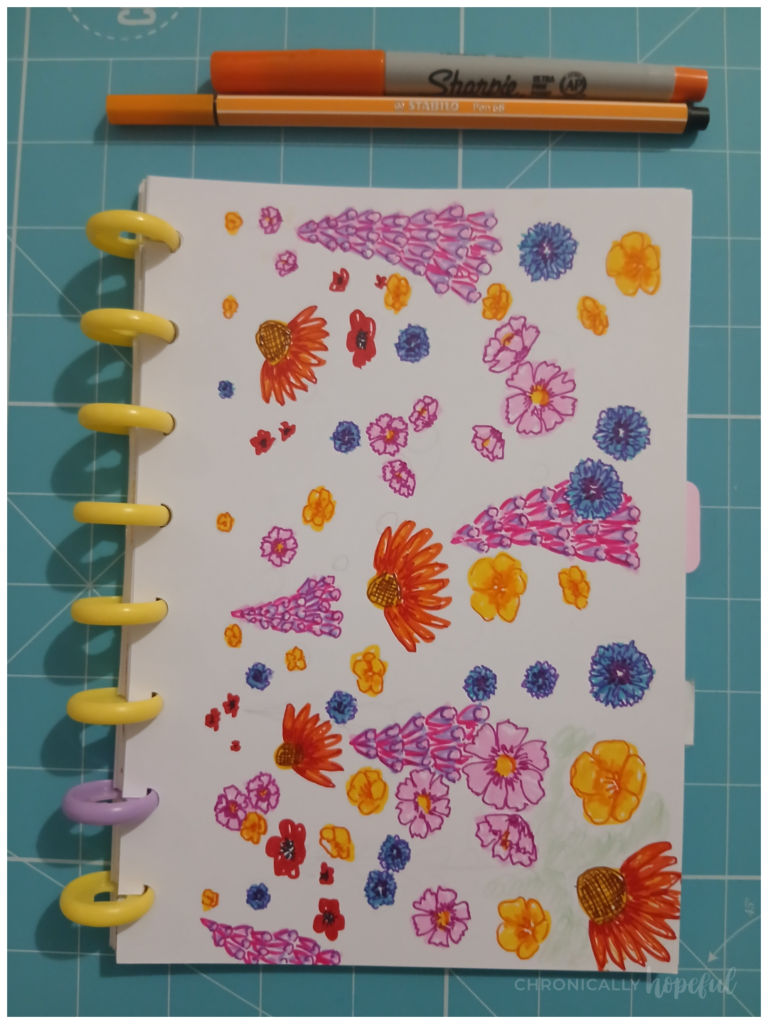
The next part was really fun for me. I enjoyed filling in the various types of foliage. I started with light green and then went in two more times with darker shades to add more and more definition. It was looking more full and chaotic, but also more interesting to look at, more textured.
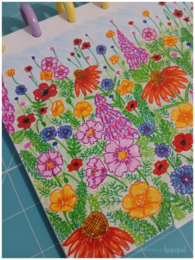
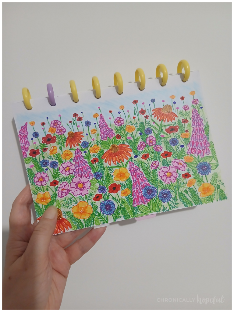
At this point I was pretty happy with it, not my favourite piece, but for low energy days, I think this came out nicely enough. So I moved onto my second piece, which you will see later in this post.
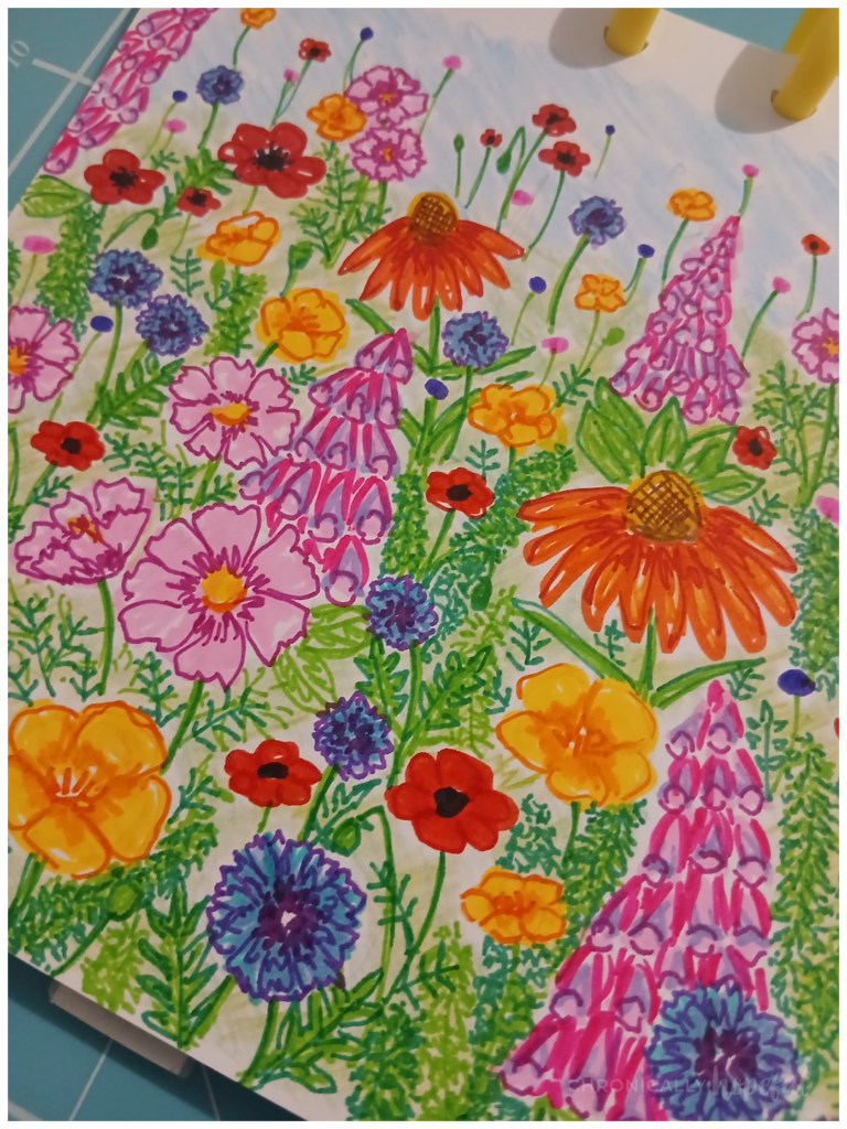
You will see I really was missing the black lines, because that piece is completely done with black ink only. And I love it! Once that second piece was finished, though, I was inspired to pick this one back up again and just go ahead and add more definition and contrast.
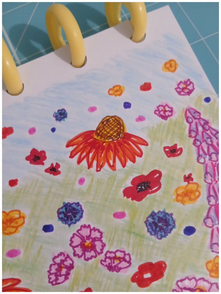
So I took a dark green marker and coloured the spaces between the foliage and flowers. The parts where the pale pencil was showing through. At this point I was convinced I’d destroyed the picture, because it didn’t look good anymore. But I kept going…
Heatwave. Fatigue. Low light. Reclined.
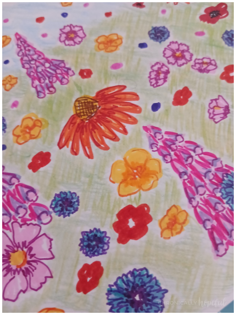
Hating how it looked at this point, the background being uneven and weirdly enveloping the flowers and foliage, like a green fog. I picked up a black brush pen and started adding outlines.
The more I added, the more I loved this piece again. The black just makes everything pop!
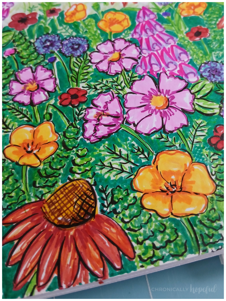
This brush pen has become one of my favourites for drawing as it creates varying line weights which provides a sense of movement and even adds the effect of shadows in some instances.
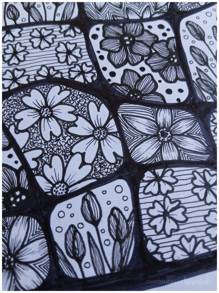
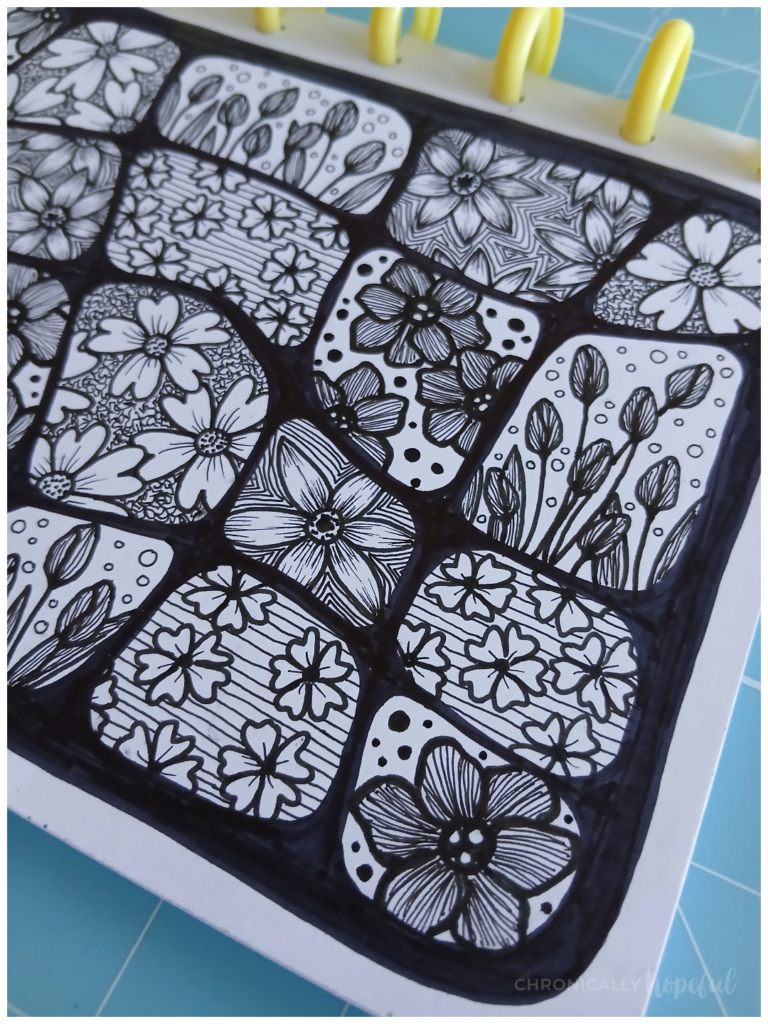
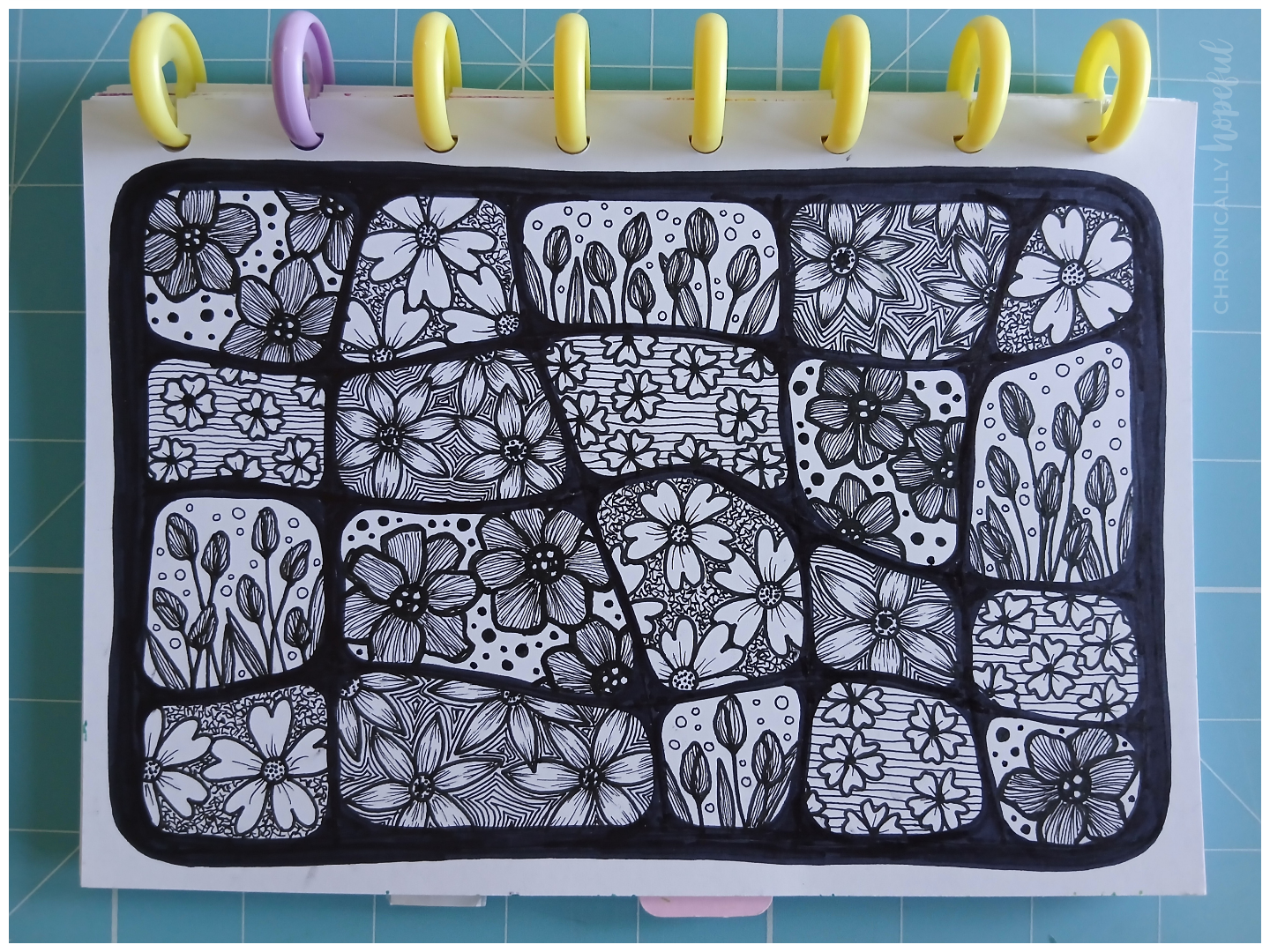
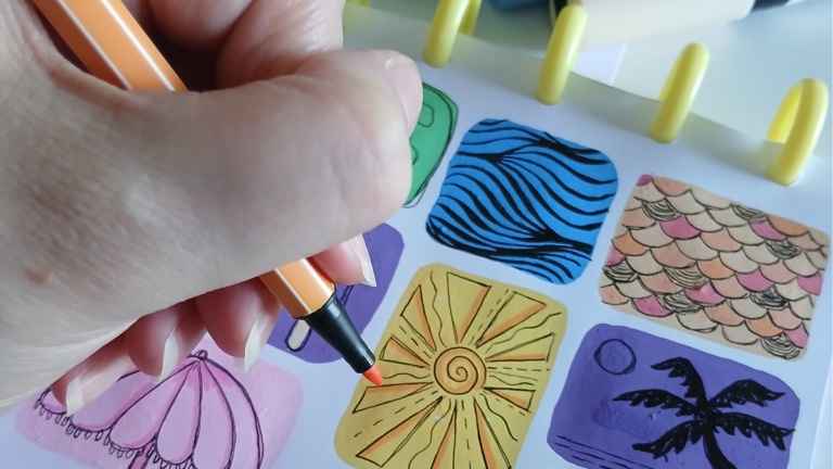
Botanical Line Drawing – Fine Liners
This piece is more in line with what I usually do. Line drawings with black fine liner or ink being the prominent feature. Sometimes there’s colour and sometimes it stays black and white.
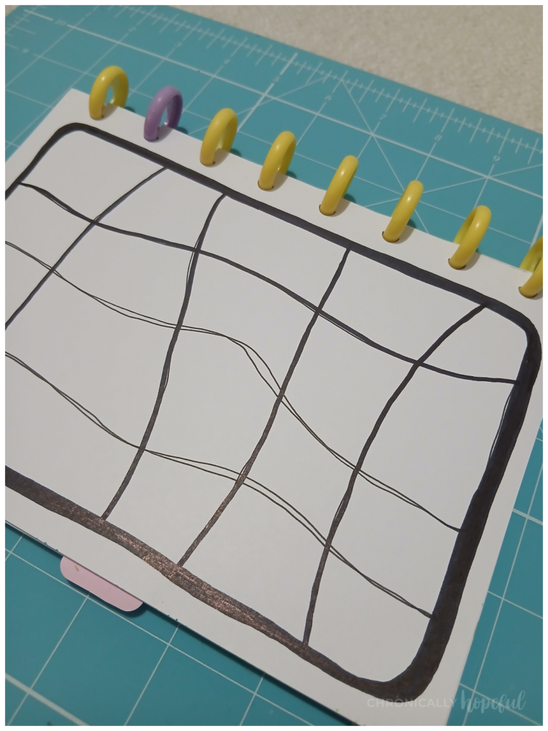
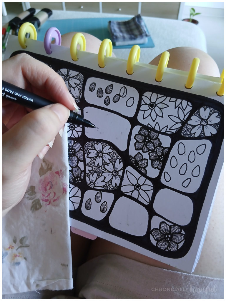
I started with a loosely drawn grid in my art journal. I used a juicy n.8 fineliner. It’s waterproof, so if I want to colour it later on, the lines will stay put and not smudge into the colour. I used the same pen to draw the flowers.
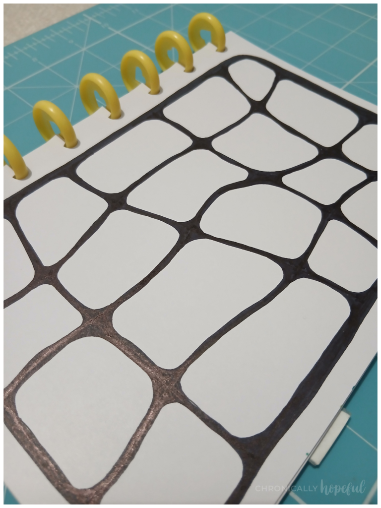
I then thickened the page border and grid lines. Then, wherever the lines crossed, I filled in the sharp angles to create these more rounded, bubble-like shapes.
First I drew the large petal flowers, thickening their outlines and using fine lines to darken the petals. I initially left the background in these shapes empty as I wasn’t sure how I wanted to contrast the dark flowers.
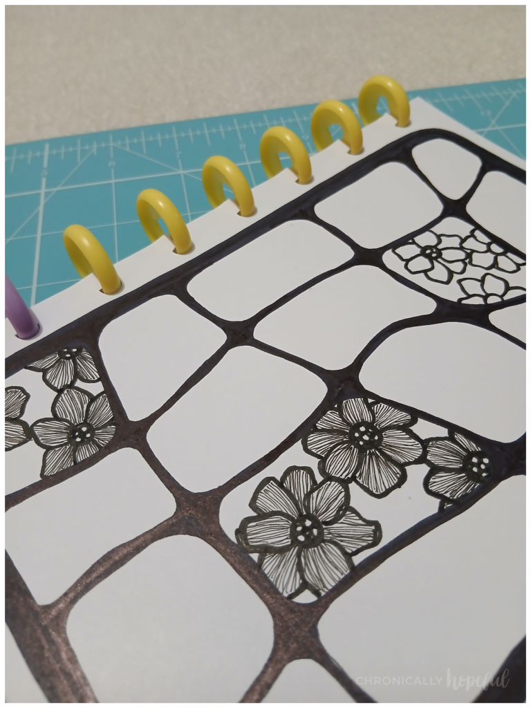
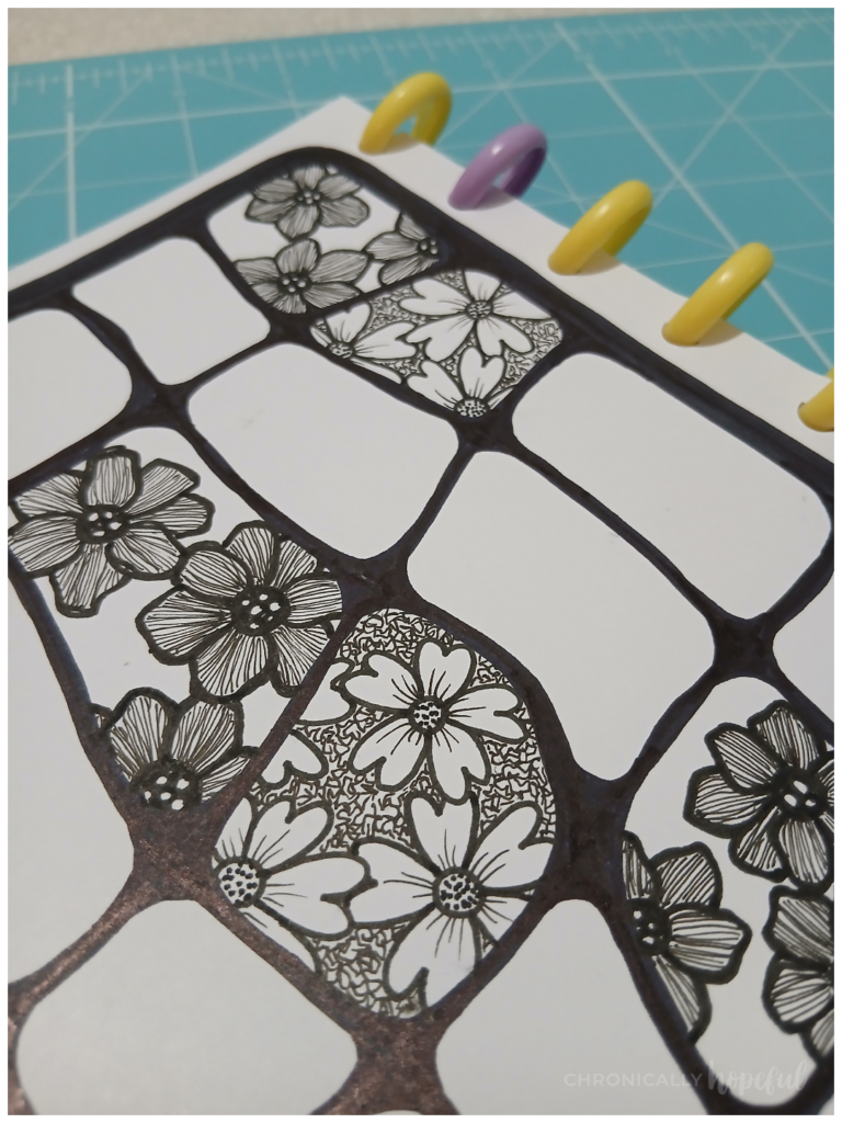
Then I drew the heart shaped petals which I left lighter, only adding a few detail lines. I opted to shade the background around these flowers instead. Just made tiny squiggly lines all around them. This created some contrast and made them pop.
As you can see, this piece was also done while reclined on the sofa. I just worked on my legs. I use a little cotton cloth to rest my hand on my art, because in this heat I sweat a lot and smudge everything with my left hand. It still happens when I use the cloth, don’t ask me how, but much less at least.
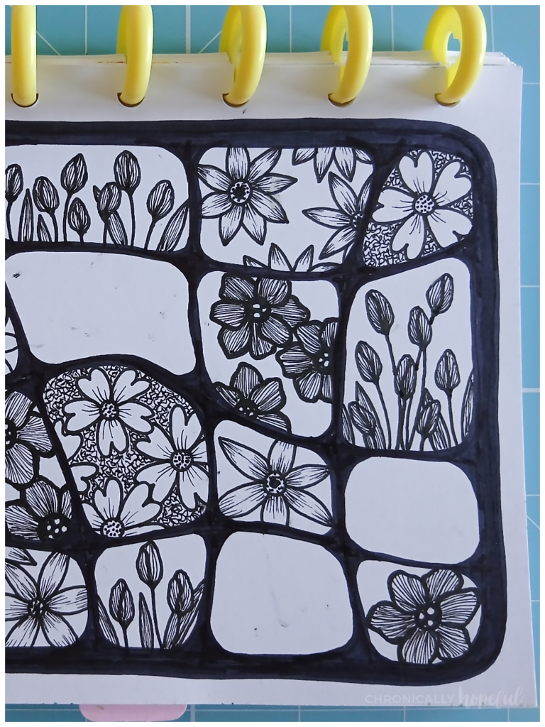
Next I drew sunflower type blooms and some tulips. I guess tulips are technically spring blooms, but that’s okay. They add some variety in form. I used super fine lines to shade these and their leaves. Leaving the background empty for now.
For the sunflowers with the pointy petals, I used fine lines to shade them at the base and at the tip. I love how it makes them come alive. Such a simple detail that makes such a difference. See the picture on the right, above.
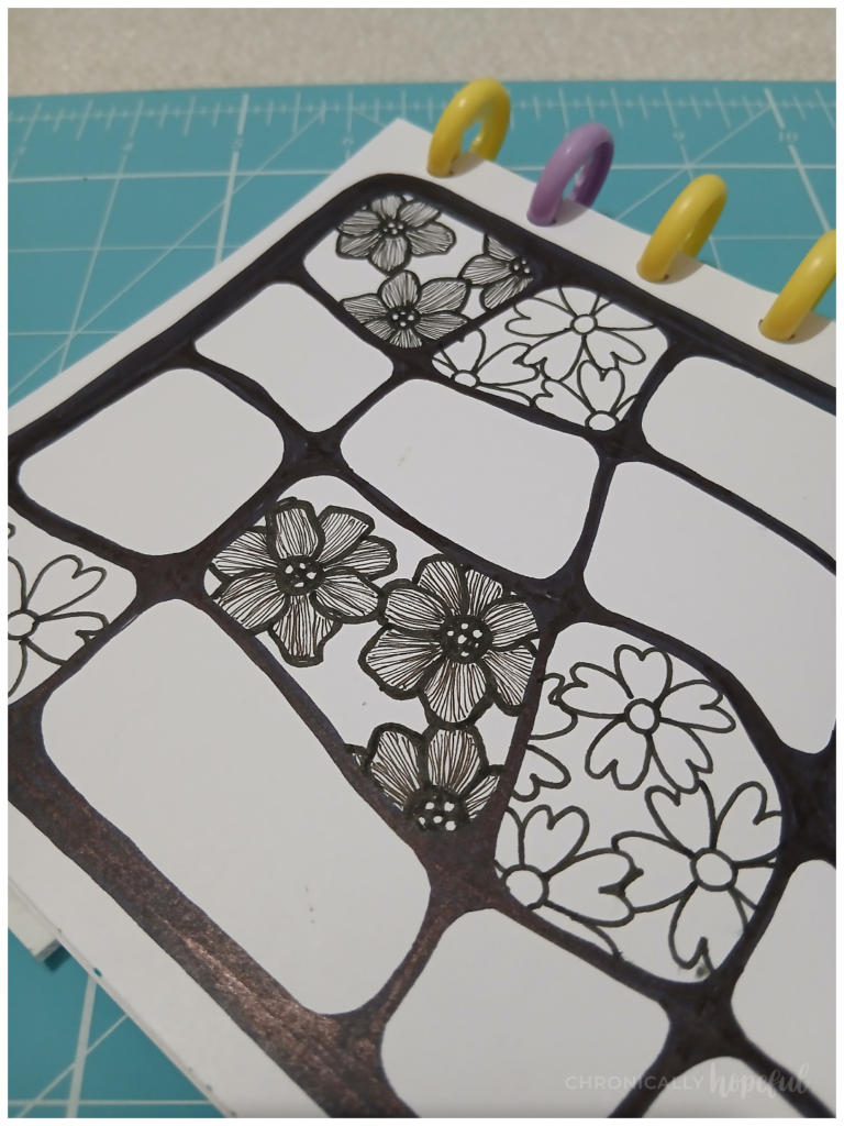
Since I had 20 spaces to fill, I had decided to do 4 of each design. But of course I didn’t plan ahead, and just drew them as I went. At least I think most of them are spaced out pretty evenly regardless of my lack of planning.
I’ll try be more intentional in the future though, because it wouldn’t be great if after all that drawing, two of the last spaces got the same design right next to each other. At least this time they ended up diagonally adjacent, so it’s not too bad. (see below, right)
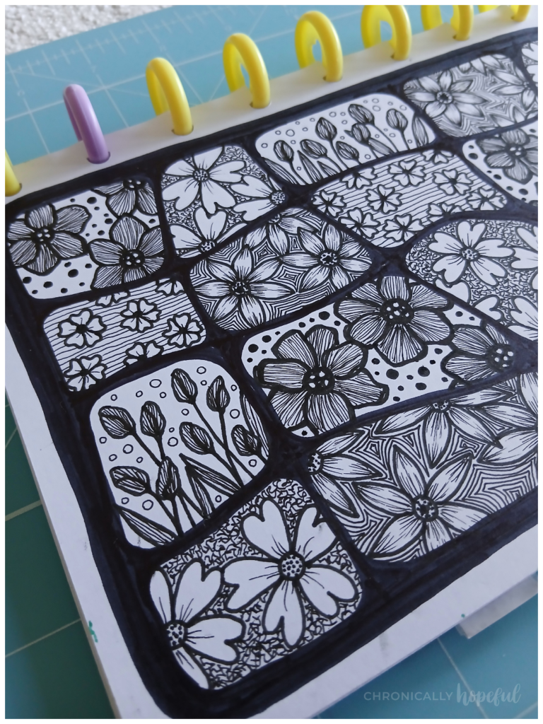
With just the last 4 spaces to fill, I decided to draw some small flowers and intentionally left a lot of blank space around them because I wanted to draw some horizontal lines. The tulips and their leaves had lots of vertical lines, even their form is upright and vertical, so I wanted to add the contrast of horizontal lines to this piece.
These are my default 5-petal flowers whenever I want to fill a space in a composition. Usually I do them with brush and paint though. Then they sort of look like cherry blossoms.
After filling each space with its blooms, I went back to decorate the background of each one. So, for the cherry blossoms I did those horizontal lines, and for the tulips I added little bubble-like circles. I wanted something light and airy that wouldn’t take away from the more detailed tulip design.
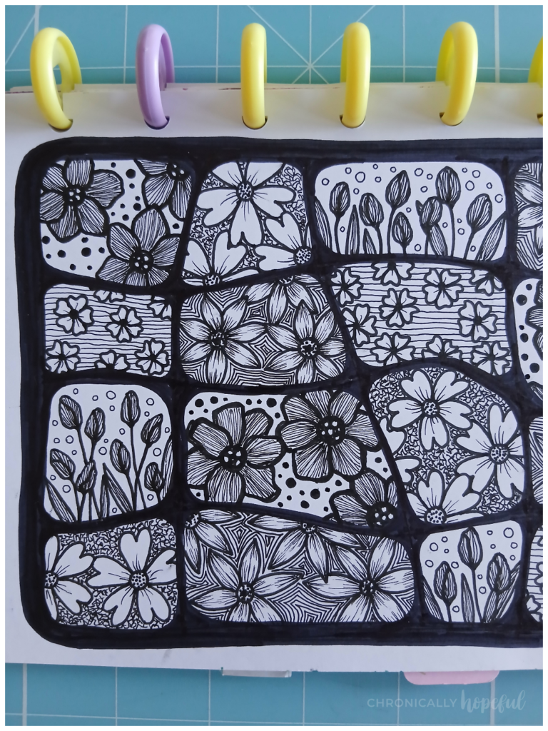
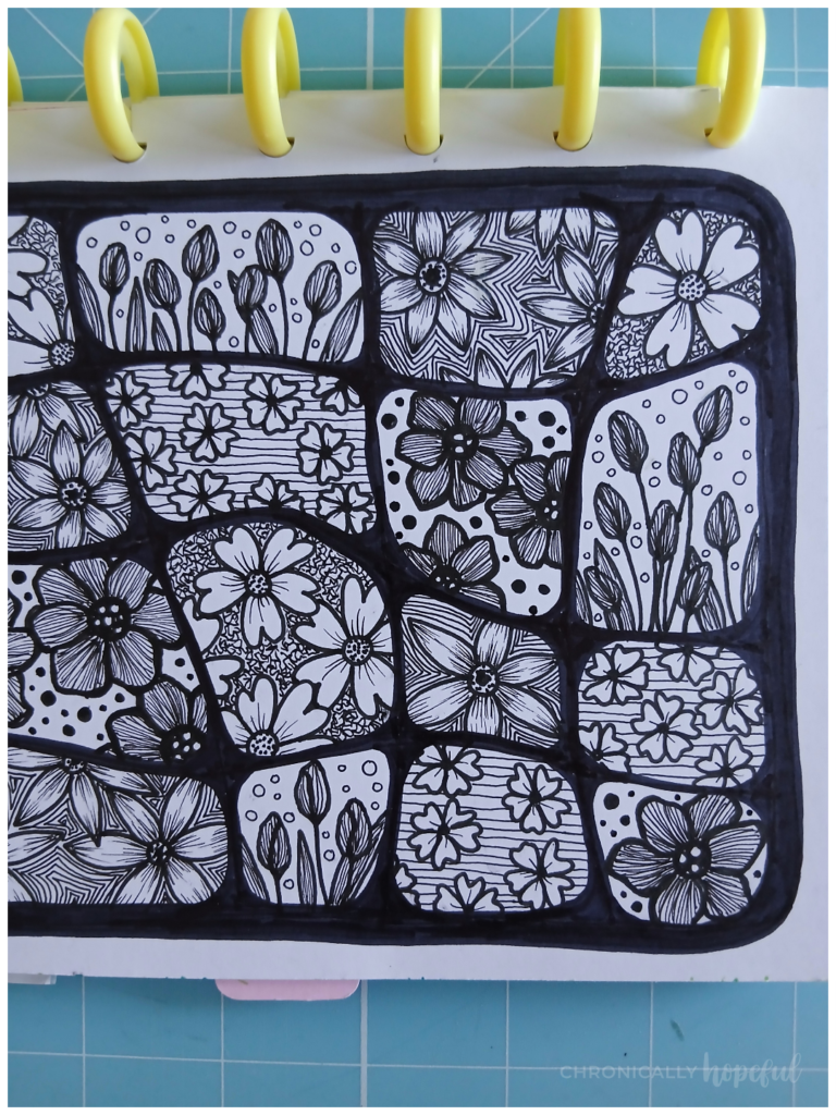
For the sunflowers, I did a sort of zentangle spiral pattern, just filling in any blank space by outlining it again and again. As the space became filled with lines, it created a spiral effect.
Then for those large petal flowers, I made the same type of circles as for the tulips, but I coloured them in to maintain that contrast. It was also a good way to cover up some of the smudges I’d made around those flowers.
Of course, the first background I had decided on was the squiggly lines around the heart-shaped flowers which I’d added right away when I drew them.
It’s always interesting, to me, to see how some things are decided and sure immediately, while other things remain uncertain and undone until later when more of the composition becomes clear.
As you can imagine, with this way of working, I don’t actually know what a piece will look like until it’s finished. I have a general idea of what I want to accomplish. What style or theme I’m aiming for perhaps. I have techniques or supplies, colours or shapes that I want to work with and then the pieces are born from that.
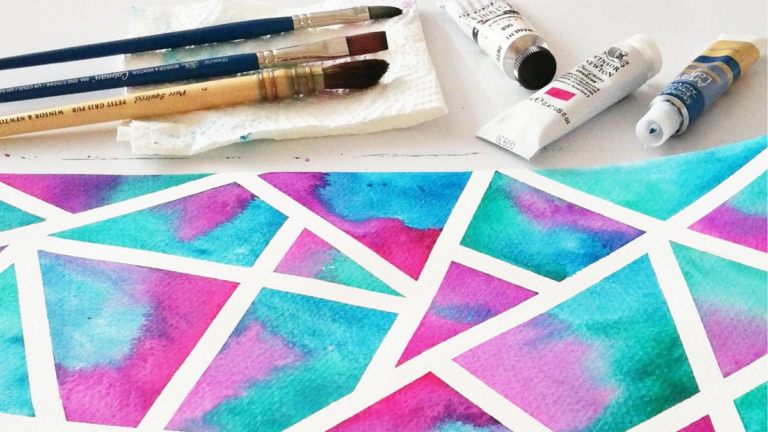
Over all I am very happy with this week’s pieces. There was a third one I wanted to do, but it involved painting and I have not been well enough to safely manage jars of water and paint around the sofa!
New Participants Have Joined!
I have been tagged on social media and in the comments on a previous CH52art post by some new participants, which is always exciting. I didn’t promote this project much before I launched it, so I expect maybe more people will join as the project grows over time.
In the meantime I will keep on going. This is a personal challenge for me, but I am so happy when others join in and we all get to grow in our crafts and be inspired by each other’s creativity.
If you’d like to join us, you can hop in (and out) anytime you like. It’s a low stress project, so you can go at your own pace. Being chronically ill means sometimes I can make 3 pieces of art in a week and other times I will struggle to make one. There’s no pressure here. Life happens.
You can even go back and do the previous prompts too, if you feel fomo. I know some people don’t like the feeling of having missed something in a series like this. It’s all good.
The 52-Week Art Project is a fun way to stay motivated – with a weekly schedule, have some direction – with prompts, have freedom – with which mediums to use and how to interpret the prompts, as well as community and accountability – with the sharing online aspect.
So, I hope you’ll join us in this creative adventure!
Let me know what you think of my creations for this week, and click the button below to see all the creations so far or to upload your own to the gallery. Happy creating!
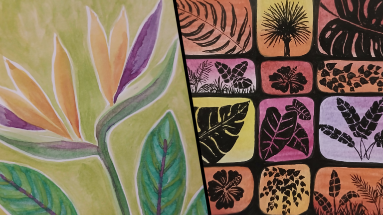
Next Prompt: Tropical Island Vibes
I’m looking forward to this one! If you’d like to jump in and join me on this creative adventure, you’re very welcome. I’d love to see how you interpret the prompts.
You can upload an image of your creations to the gallery, or just browse others:

Blog Parties & Link-ups where I’m sharing this post. Click here to see my link-up calendar and find new blogs to enjoy!
Discover more from Chronically Hopeful
Subscribe to get the latest posts sent to your email.
Your artwork is absolutely beautiful, and I really enjoyed reading about your creative process. I love how you didn’t give up on the wildflower meadow. The botanical line drawings are gorgeous too.
Thank you so much, Lisa. I’m glad you enjoyed reading about the process. I was happy to find your blog and art too. Your papercuts are lovely. I’ve only ever tried it a few times, but I bought a girocut tool years ago because I was very curious about trying papercut art.
Very nice! Visiting from #MMBC. Have a great week ahead, take care.
I hope your garden blooms soon, my flowers were not doing much until last week and now they’re looking much prettier. What pretty art work.
Thanks Kim! That is encouraging. I hope my garden will also decide to wake up and bloom soon. There are buds on some plants now, but they’ve been budding without blooms for over a week. I cannot wait for them to open!
These are beautiful! This challenge prompted me to break out my watercolors for my summer blooms. So thank you for that. I’m hoping to tackle a quill pen and ink drawing of a pineapple for tropical island vibes.
I love how your wildflower meadow turned out! Really appreciate the step by step process – you don’t have to go in there all gungho, little bits and then you can fill in. I am not a good artist at all, definitely not creative on that side, but I love this technique so may get a blank journal and see what happens with my doodles! 🙂 Sim x
Your artwork is gorgeous, Char. I love the wildflower meadow, it’s so pretty!
The botanical line drawing is brilliant too. It’s great to see the whole process.
Thanks so much for sharing with #MMBC. Hope to see you next week. 🙂
Thank you so much, Jayne! I will certainly be joining in whenever I am able. I’ve really enjoyed connecting with new blogging communities since relaunching my website. I prefer this side of the internet these days, personal blogs, getting to choose what content I consume, without the algorythm’s interference. Making meaningful connections with real people.