If you are a blogger with an Instagram account, you will be very aware of the frustrating limit they have placed on us. I love Instagram, it is probably my favourite social media platform, but I must admit that the one-link-only rule has been very frustrating over the years.
In this post, though, I am going to show you how I have overcome this obstacle and gained more click-throughs to my blog without using another app like LinkTree.
Update 2024: Instagram now allows 5 links in your bio, but if that’s not enough for you, if you’d like to feature more content from your own website, then the following will still be helpful to you.
What Is LinkTree?
For those who are not familiar with it, LinkTree is a website that offers users a way to add multiple links to their social media profiles where they only have one active link. You still only have one profile link, but it will open your LinkTree page where you can display more links.
This is a great option for people who don’t have their own website, but like to share links to other websites or content they like or frequent, causes they support, etc.
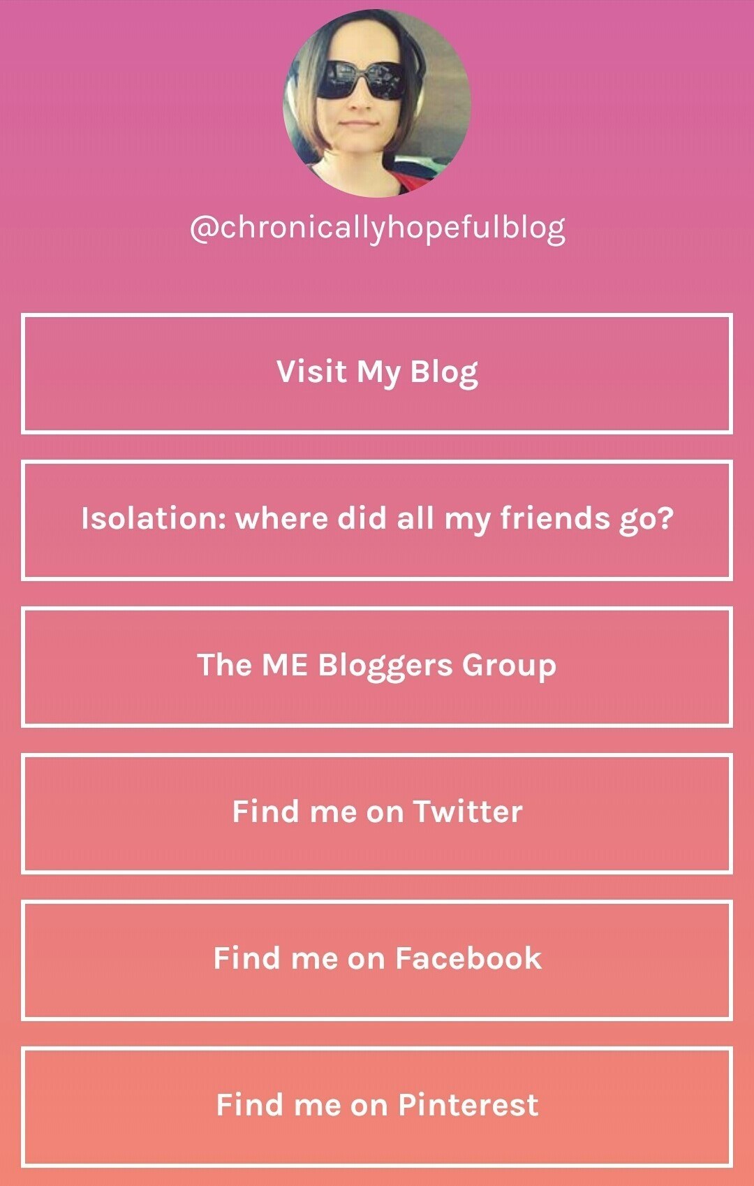
LinkTree Example
As you can see here, it creates a little page for you with buttons you can link up to any web page you want to link to.
It looks pretty clean and simple, there are a couple of different colours you can choose for the background, but not much else is customisable on the free version.
You can also sign up to the paid version, which will have more options, but I really think the solution I explain below has many more benefits, especially for bloggers.
A Stroke Of Genius
My little sister, who blogs over at Chronic Blogger, has basically put her life on hold to become my full time carer. She is an amazing human, very smart and selfless, so when I was unhappy with the one-link-only limit on Instagram and was considering using LinkTree, she said something left me speechless.
“Why don’t you create a landing page so all the traffic goes directly to your own site instead of LinkTree?”
– Chronic Blogger
It wasn’t that it was an incredibly bizarre or difficult solution, but the simplicity of it that blew me away. Why has nobody else thought of this? Why is nobody else doing this? Needless to say, I cancelled my plans to use LinkTree and implemented this on all my Instagram profiles right away!
But Why Not Just Use The Third Party App?
Any time you rely on a third party app, you risk losing your content at some point. Over the past few years many companies have gone out of business, their services shut down, leaving us scrambling to find alternate solutions. Sometimes it’s just a technical issue that makes these apps bug out and no longer work properly, even if just for a few days or weeks until they fix the issues. It’s still not the best for anybody who relies on the service.
Even if third party apps like LinkTree sort out their issues with Instagram and the service continues, there are actually quite a few benefits to not using them and using your own landing page instead. Apart from simply getting more links on Instagram, you will also benefit from:
- All traffic from your only live link on Instagram will go to YOUR website instead of Linktree.
- You get to choose the layout and format of the landing page, include images too!
- The landing page can be branded, creating a cohesive look and familiar feel.
- You can add sign up forms, polls or a call to action directly on the landing!
- Linking to a landing instead of your homepage means you can feature specific pages or posts and customise the page to suit your Instagram community.
I couldn’t believe I had not thought of this myself. I couldn’t believe that I had not seen this yet on any of the huge influencer profiles I follow either!
Why was nobody building their own beautifully branded landing pages for their Instagram profiles? Now that is bizarre!
Update 2024: I now see many more people with customised landing pages, it took a while though. I know that many people don’t feel tech savvy enough to create custom pages on their websites and that might be why most opt for third party apps instead.
How To Create A Landing Page On WordPress
Creating a custom landing page is easier than you think!
I use WordPress, so this advice is only relevant to WP blogs. For Blogger or other platforms, you will have to play around in your theme settings to find everything mentioned below, but the main thing is simply creating a new page you can populate with links. The rest is optional.
First, you create a New Page using the Dashboard menu on the left.
Then in the Page Attributes settings on the right of the page editor, you can choose the “Landing” Template. This part is optional though, as most Instagram users are on mobile devices and your pages will automatically be rearranged to fit mobile screens anyway (for example, sidebars generally get moved down to below the other content on mobile devices).
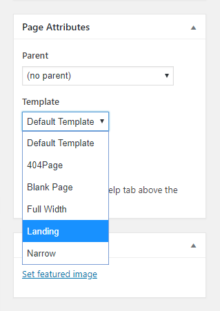
Most pages will use Default Theme Templates, but you could use a Blank Page or Landing Page template. This should remove most of the menus, widgets and other items you usually have on your blog, which take up loads of space, and give you a blank canvas to work on.
This method should keep just your logo up top and your website footer at the bottom – all you will need to add are text or image links to the content you want to feature. If you only have the Default Template available, that’s fine, your sidebar will just load up under the links you post on your landing page.
Widgets can be helpful in a sidebar, but on a mobile landing, they can take up space and are unnecessary.
There are a few other settings you might want to tweak to make this page more streamline, but depending on the Theme you have installed on your blog, these settings might be in different places or not available at all. You will have to browse through your Dashboard menus and Theme Options to find them, start by scrolling down on the page editor and see if they are further down on the page:
- Remove the Like button
- Remove the Share buttons
- Remove the Page Title
- Remove Comments
The only reason we remove all these things is they are unnecessary and cause clutter. Large headings take up much screen space which could be put to better use.
On my theme, these options are all available on my page editor window, by scrolling down to below the text box I find my Theme Options where these settings can be adjusted for the page I’m currently editing.
What To Include On Your IG Landing Page
- Your Website Logo: branding is familiar, looks professional, promotes brand awareness.
- Text or button links: This way your visitors don’t need to scroll much as you can fit many links in a small space that looks good on mobile devices. It’s compact, but maybe less eye-catching than our second option.
- Graphic links, like you would use on your homepage: use your post header images to draw attention to your links.
- Call To Action: you can include a contact form, sign up form for your newsletters or courses, giveaways, polls, all sorts of things! It’s one less step for your visitors if the actions are directly on the landing page.
Why I Chose A Custom Instagram Landing Page
I have chosen not to link to my homepage, because I often feature older posts on my Instagram profile, posts that are no longer on my front page and will be hard to find without a direct link. I also sometimes want to link to advocacy tools or petitions that our community might be interested in and without a personalised landing page, it would be harder for my readers to find these links.
Click here to visit my Instagram profile and check out my current landing page. It’s changed many times since I created it, depending on the topics I featured on IG or the seasons or causes I was focusing on at any given time.
The key features I have included on my landing pages are:
- My blog’s logo: this helps with branding and familiarity and links directly to my homepage.
- My latest post or time sensitive content: regardless of what I’m featuring in my Instagram feed, my regular visitors can find a link to my latest post or any time sensitive petitions up top.
- My featured posts: this is where people can find eye-catching links directly to any post or webpage I mention in my Instagram posts. This features the header image of each post, similar to the image that appears in my Instagram feed, so that it is easy to recognise.
- A few button or text links to other relevant content: Perhaps downloadable documents or links to frequently requested information. Features only the title in text form. This takes up less space than graphics, but is less eye-catching.
- A call to action: I chose to feature my newsletter sign up form here so that people can follow my blog and latest updates via email if they want to.
- My social media links: this is to help visitors find me on other platforms they might be using. I use just plain text links all in a row, so they take up little space.
Now I’ve added a bit of everything on my landing page, you don’t have to do it this way. You could use a simple layout that matches your blog, include your logo, and just create text links one below the other, like LinkTree does, so that there is less scrolling involved for your visitors.
The possibilities are endless and there really is no need for the extra monthly expense for third party apps.
The Benefits Of A Custom Landing Page
As you can see, creating your own landing page for your Instagram means that you can personalise what your visitors see and offer them direct links to the content that interests them regardless of what appears on your blog’s homepage.
You can add your actions and forms directly to the landing page to streamline your Instagram readers’ visit – a more user-friendly experience for them means they’re more likely to interact.
The page can be designed to match your branding or it can be changed for different seasons and events. All at no extra cost to you! It’s easy to manage and you don’t risk losing the functionality if the third party web service suddenly goes out of business as we have seen a few do recently (Board Booster and Stumble Upon for example).
Don’t you think this cheaper and less risky alternative to Linktree is a much better way to create more direct links to your website or online store?



This was so helpful! Thank you for sharing these suggestions.
Glad you found this helpful! x
Hi Charlene – this is an amazing post – I shared this already on FB. I just joined the free Linktree earlier this week and now found this post. WOW. I will for sure look into this and may get back to you for help should I get stuck.
Glad you found this helpful. Thanks for sharing. Just shout if you need help! x
Great idea!!
Thanks – I’m glad you like it. I have done this for all my IG accounts and it’s so much better.
Very cool! I hadn’t thought of this either but now I will work on putting one together!
Such a simple solution, I couldn’t believe I hadn’t seen this done already.
I love this idea. I am not sure what I would put on my landing page yet but I like that ability to configure having it when I am actually ready.
Glad you like the idea, I think it looks much better than the ones provided by third party apps.